Monday, September 30, 2013

Government Shut Down!! Remain Calm, Keep Perspective

With this weekend's political outcomes concerning the budget, today the S&P 500 opened down about 1%, well below the 1690-1700 support area and currently resting just above the 50-day moving average.


Source: Stockcharts.com

Investors are concerned about an impending government shutdown and what it might do to an already fragile economic recovery. That said the S&P 500 futures reached a low of about 1670 pre-open in the early AM, with a bit of a rally ensuing, and the flatter Russell 2000 Index is not down as much (-0.2% vs. S&P 500's current -0.5%), inferring breadth is holding up comparatively. Note in the chart above that support exists at around 1670-1675 near the prior highs in May, and then at around 1660-1665 with the rising trend line.

Many may forget what happened in late 1995 into January 1996, the last time the government shut down.


Source: Bloomberg

The chart above shows the S&P 500 at that time along with the Conference Board US Leading Economic Indicators Index (blue shade). The market took everything in stride, suffering a few minor declines during the shut downs but never putting the uptrend in jeopardy. This despite the brief plunge in the LEI at the start of 1996, with the S&P 500 then lifting off to a new high, further suggesting investors were (correctly) looking through this near-term potential calamity.

And below is what such a chart looks like from 2012 to date.

Source: Bloomberg

The LEI has been steadily rising since late last year, showing no signs of weakness, and the S&P 500 has remained in a nice uptrend during this time. Unless Congress is dead set on wreaking havoc with a protracted shut down, one that will drag on for many months and likely plunge the country back into a deep recession, I have to think investors will once again -- as in 1995-1996 -- discount the worst-case scenario fairly quickly and this recent market decline should be temporary. 

Some have even pointed out that the US sovereign CDS spread has spiked of late, reflecting real and growing investor nervousness.

Source: Bloomberg
However, as shown in the chart above, this CDS spread has been much higher in the recent past, making this latest pop higher not much to get worked up over. 

During times like this, it pays to maintain perspective and not get caught up in the hysteria being blared by CNBC and the media. Remain calm, think rationally and use history as a guide -- all of which will always serve one well when managing financial assets. And yes it may be different this time, but most of the time it's not.

Thursday, September 26, 2013

It's all uphill from here for active management

The cover of the recent issue of Institutional Investor magazine reads, "Is Alpha Dead?"


It's official: over the next few years, active managers should do quite well!

Granted, II magazine does not have the circulation or expansive reach of Time or Fortune, but I would argue the go-against, contrary power of the front cover still applies. II is no different than any other periodical in distilling the consensus opinion(s) of the day and if deemed alarming enough is then plastered on the magazine's front cover. The readership may be less, but the process very likely remains the same. In that sense, I'm willing to bet that alpha is not dead and active managers will not go the way of the dinosaurs. (Of course, being an active manager myself, I'm talking my book, but I stand by my objective reasoning!).

Wednesday, September 25, 2013

The Stealth Bull Market in Technology Stocks

If you were to pay attention to just the XLK, you'd think technology stocks in general have continued to struggle versus the market. And you'd be wrong.

The chart below shows the relative performance of XLK (black line) and RYT (red line).

Source: Stockcharts.com

As a reminder, the constituents in the XLK are market-weighted and those in the RYT are equal-weighted, the latter providing a more accurate depiction of sector performance. Whereas the better-known XLK has been steadily trailing the market (SPY) since September of last year, the less-popular RYT has exhibited quite a different picture. After putting in a double-bottom by last October, RYT outperformed from November to February, then retrenched for a few months only to resume its outperformance, establishing to date an impressive multi-month relative uptrend.

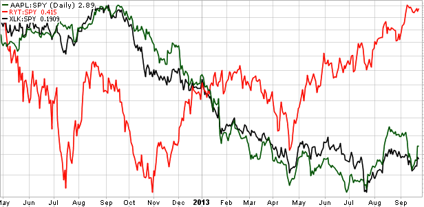
Needless to say, the primary culprit for XLK's anemic showing is Apple (AAPL). Its huge market cap along with its equally huge following by investors and the media has a way of overshadowing anything else occurring within the sector. AAPL is an enormous tree that towers over the forest.

The chart below makes evident Apple's undue influence, showing the relative performance of RYT (red line), XLK (black line) and AAPL (green line).

Source: Stockcharts.com

Pretty plain to see. When AAPL has outperformed, so too has XLK, and vice versa. It's as if RYT is nearly a completely different animal. Given this tight AAPL & XLK relationship, the ETF overly represents a single company at the expense of fully reflecting the entire sector.

Bottom line: while AAPL and XLK's relative returns have suffered until more recently, a majority of tech stocks have been doing very well in that time.

Tuesday, September 24, 2013

Market Update

Last week, I discussed the market's bullish breadth and continued risk-on confirmations juxtaposed with the bearish seasonal tendency for this time of year. I concluded, "if the S&P 500 does successfully get through the 1710 level, doing so meaningfully with some force, I would have to think such an occurrence would go a long way towards negating this seasonal headwind." Just hours after writing that sentence on Wednesday, the market did indeed forcefully soar to a new high, with the S&P 500 bursting through 1710 and almost reaching 1730 by Thursday. 

As shown in the daily chart below, the Index has since retreated back to prior resistance (now support) at about the 1700 level.

Source: Stockcharts.com

My frequent reminder: a pullback after a breakout is quite common and should not necessarily be perceived as bearish. In fact, as long as price holds at support, such action can be welcomed as it reenergizes the prior breakout move and sets up for a resumption of price climbing higher. Note also the S&P 500 met up with trend line resistance before retreating, and the volume spike could signal near-term capitulation (similar to the June occurrence). 

With this recent breakout, breadth measures remain bullish. The S&P 500's A/D line achieved a new high coincident with the Index, confirming the move higher. The Russell 2000 -- in itself a good measure of breadth -- continues to outperform the S&P 500:

Source: Stockcharts.com

Note that yesterday the Russell 2000 reached a new high versus the S&P 500, further indication of breadth remaining strong despite this recent pullback in the market.

A few words about last week's Fed announcement. The decision to taper talk of tapering was a pleasant surprise to investors, as evidenced by the market's run to new highs. While price inflation remains subdued, in large part due to a slowly improving yet underperforming economy, QE has worked to inflate the equity market. Keeping interest rates exceptionally low has not been enough to reinvigorate our economic engine, and yet the Fed believes without such continued stimulus we'd be much worse off. And judging by last week's response, investors appear to agree. 

Earnings have not been especially stellar so what QE has helped achieve is multiple expansion, which among other things is generally a reflection of sentiment and liquidity. Although economic conditions could be better, investors are less concerned when they have the Fed in their corner. The saying "don't fight the Fed" has seemingly been morphed into "do ride with the Fed," and what a ride it's been....

Wednesday, September 18, 2013

Market Update: Many Bullish Indications, But....

Yesterday I wrote about how this rally off the August 27th low had good breadth, a bullish tailwind for the market.

I continue to see other bullish indications. Looking at several risk-on/risk-off measures, the bias continues to be risk-on.

Source: Stockcharts.com

Shown above, small-caps have maintained their uptrend in outperforming larger-caps, high-yield bonds have done the same versus T-bonds, and likewise cyclical stocks continue to do better than staples, recently hitting a new relative high. The bottom line is riskier assets have been outperforming their safer, more conservative brethren, generally a bullish setting for the market.

The daily chart below shows that while the uptrend for the market remains intact, it has started to level off a bit, with trend lines tilting more horizontal.

Source: Stockcharts.com

Nothing overly worrisome and is a natural occurrence with a maturing advance. Note that the MACD triggered a buy signal earlier this month and the stochastic, while overbought, is extreme and beginning to traverse sideways at this extended level -- signs of "good overbought" development (see red boxes for past examples, price continues to rise).

Based on what I follow, the market currently has many things in its favor, however I do want to see the S&P 500 successfully get through the prior high level of 1710. As shown in the chart above, we're not quite there yet, and as always I'd want to see a meaningful breakout, i.e. not just getting to 1710-1711 but rather beyond 1712.

A concern I have has to do with seasonality. I wrote late last month, "I would argue that since May 1st,  the S&P 500 has more or less tracked the seasonal averages directionally. Note that all three seasonal lines show the S&P 500 rising from the end of August and peaking out not long after mid-September." In that time, the S&P 500 has indeed risen by a bit more than 4%, again following seasonal tendencies.

But, as shown in the chart below, on average the next few weeks have been rough ones for the market.


Source: Bloomberg

Judging from the 5- and 10-year average performance lines for the S&P 500, the Index has tended to peak out and decline from mid-September to about mid-October. And as already mentioned, the Index has more or less directionally followed the seasonal script up to this point (purple line), particularly in the last few months.

I would point out that 2008 can dramatically impact the calculation of these seasonal studies. From 9/19-10/10 in 2008, the S&P 500 plunged by a whopping -28%, which greatly skews the 5-year and, to a lesser extent, the 10-year averages. In the chart below, I show the 5-, 10- and 30-year averages for the S&P 500 from mid-September to the end of October, but I also show a 10-year average without the year 2008 (blue line).

Source: Bloomberg

Even after excluding 2008, the general trend for the market tends to be down over the next few weeks.

Of course, if the S&P 500 does successfully get through the 1710 level, doing so meaningfully with some force, I would have to think such an occurrence would go a long way towards negating this seasonal headwind. However, that hasn't happened yet and until it does the seasonal charts above will be at the forefront of my mind.

Tuesday, September 17, 2013

Market Breadth Has Been Bullish

I am crunched for time today, I will be back with more tomorrow, but I wanted to post the following exhibits.

Since the low of August 27th, the market (S&P 500) has staged an impressive rally, climbing by more than 4% in that brief time. It's very encouraging to see that this rally off the low has been broad-based as market breadth has more than kept up, showing few if any signs of bearish divergences.

In fact, the A/D line for the S&P 500 has pulled ahead of the Index:

Source: Bloomberg

This bullish market breadth can also be seen with the equal-weight S&P 500 (RSP) recently hitting new highs versus the SPY:

Source: Stockcharts.com

Finally, at the risk of overkill, the following exhibit shows equal-weight S&P 500 sectors versus the S&P 500 (cap-weighted):

Source: Stockcharts.com

Of the nine major sectors, six have outperformed the Index, two have slightly underperformed and utilities have just been crushed. Overall the equal-weighted representation further shows solid breadth in this recent advance, a bullish tailwind for the market.

I must run but will have more tomorrow.

Friday, September 13, 2013

Why No Inflation?

Despite our having a Fed chief nicknamed "Helicopter Ben" and after several rounds of QE, we continue to see inflation remain very subdued. Year-over-year change in the CPI has been trending down for many months:

Source: Bloomberg

As has been the case for expected future inflation:

Source: Bloomberg

And yet the growth of the Fed's balance sheet remains in a healthy uptrend:

Source: Bloomberg

A primary reason for the lack of heightened inflation has been the continued significant slack in the economy. The degree of slack can be seen in the following exhibit:

Source: http://bilbo.economicoutlook.net/blog/

It shows actual GDP versus potential GDP (as per the CBO), with the difference called the output gap (i.e. slack in the economy).

The output gap recently ballooned to 10%, shown below (blue line):

Source: http://bilbo.economicoutlook.net/blog/

Yes, our economy continues to gradually improve, but the pace of this recovery continues to fall behind what would've been achieved if the economy was at full capacity. If not for this sizable output gap, and given the Fed's actions, we'd likely see much higher inflation.

It's that simple. I realize there's more than one factor or influence at work here, but until the economy is able to more robustly make up lost ground as it improves, inflation will likely remain relatively benign.

Wednesday, September 11, 2013

Housing stocks, and another example of price leading the news

Recently the S&P 500 Index has put together a nice rally, appreciating by a bit over 3% since the August 27th low of 1630. Not to be outdone, housing stocks have performed even better with the iShares U.S. Home Construction ETF (ITB) rising 5% in that time.

As shown in the daily chart below, the ITB is enjoying a classic oversold pop.

Source: Stockcharts.com

Needless to say, housing stocks have been on a tear as the ITB has more than doubled since late 2011. A Golden Cross occurred in January 2012 (green circle) signaling that the race was officially on. 

However, grey clouds started to appear earlier this year. The ITB continued to make higher highs into May, but the relative price (upper inset) did not and instead remained flat for months -- a bearish divergence. Eventually the ETF gapped down in June on high volume and breached the 200-day MA. The ITB has since made several attempts to rally through its 50-day MA, but what was once support through 2012 into 2013, this key MA has become resistance. Price has been unable to successfully break through the 50-day MA as volume has picked up during this unfolding downtrend. A Death Cross occurred last month (red circle), further confirming a trend change. A few other bearish indications include the MACD remaining below zero and the RSI constrained within a depressed 30-60 range during the last few months.

The rising trend for housing stocks has clearly been broken and it appears a new declining trend has taken hold. That said I wouldn't be surprised to see this oversold rally get extended as prior high-flyers frequently do not die a sudden death, with many an investor believing this is their chance to opportunistically enter on the cheap. But again, the ITB is currently meeting up against its 50-day MA which has proven to be firm resistance of late.

On a related but separate note, I've written in the past about the frequent tendency for prices to lead or discount eventual news or released data. In my mind, it's a strong argument in favor of technical analysis or at minimum it suggests one should respect the potential implications of price action. The following chart shows the S&P/Case-Shiller Composite Home Price Index (red line) and the S&P 500 Homebuilding Index (blue line).


Source: Bloomberg

I'm not sure if it gets any more stark than this. In 2005, the homebuilder equities peaked about one year prior to Case-Shiller peaking in 2006. More recently, the equities put in their final bottom in September 2011 whereas Case-Shiller put in its final bottom on March 2012, or six months later. In fact, from September 2011 to March 2012, the homebuilder equities soared by +92%, a whopping gain prior to the Case-Shiller final bottom.

Also, note the pattern of the two lines over time, very similar -- except the equities lead by 6-12 months. And it's generally what most technicians say with regards to price discounting, that the market (stock prices) tends to discount recessions 6-12 months ahead of time, etc.

Not convincing? I will continue to periodically highlight more such examples in the future. Trust me, the sample size is quite large.

Monday, September 9, 2013

Gold update

When I last wrote about gold, its 50-day moving average was once again serving as key resistance, with price unable to get through the MA and steadily declining.

Source: Stockcharts.com

However, unlike on several occasions in the past, this time gold was able to finally break through the 50-day MA (thick purple line in chart above). Gold's price went on to eclipse the $1400 price level before pulling back more recently. Notice the multiple time period moving averages clearly show a change in trend last month as all of them were able to follow through with price and breach the 50-day MA to the upside. I believe this break in the downtrend is very meaningful and bodes well for gold, but it wouldn't be surprising to see price retrace a bit more to $1330-$1350 -- what appears to be the new support level.

It's also very encouraging to see money flow continue to climb.


Source: Bloomberg

For both GLD and GDX, money flow turned up in earnest around June and has continued to ascend, inferring underlying accumulation of shares.

I would mention a potential dark cloud remaining for gold is real interest rates. Typically the price of gold fares better when real interest rates are declining.


This relationship can be seen in the chart above, displaying the 5-year TIPS with gold. In general, the two tend to move in opposite directions, but more recently they have been rising in tandem. I would expect one to eventually change direction. Yet it's worth noting there's a fair amount of debate concerning this relationship, with many moving parts to consider such as Fed policy in relation to economic conditions, where we are in the interest rate cycle, the degree to which expectations are baked in, etc. Nonetheless, the chart above is something to keep in mind when assessing gold.

Tuesday, September 3, 2013

Crude oil continues to look bullish

I've been bullish on crude oil for many months. Prior to Syria becoming a big concern, the chart had already looked very compelling (another case of price leading news?).


Price broke out of a triangle formation in June, pulled back (a common occurrence) and then resumed its ascent, easily getting through the $100 level. For the last several weeks, crude has been trading between $104-$108 forming a pennant/flag pattern. Pennants/flags are typically continuation patterns meaning after they form, the breakout usually occurs in the direction of the current trend -- in this case up. In fact, last week price did breakout only to pull back (again, as in June, a common occurrence post-breakout).


Source: Stockcharts.com

As I've written in the past, equities typically lead their associated commodity. The chart above shows the Guggenheim S&P 500 Equal Weight Energy ETF (RYE, black line) versus crude WTI (red line). I prefer to use equal-weight sector ETFs to avoid the excessive influence of large-cap stocks. RYE remains in an uptrend with crude oil catching up to energy equities in late June into July. RYE has actually been basing since May, not able to get through the $76 level, but nonetheless its chart remains bullish. In addition, note that crude oil continues to trade above its 50-day MA (blue line), another bullish indication.

What is beginning to worry me is the sentiment on crude oil. Ned Davis Research has its latest Crowd Sentiment Poll for Crude Futures at an elevated level, but not extreme and still within neutral terrain. However looking at COT positioning, commercial hedgers -- typically the smarter money -- have not been this bearish in years.


As always, stay tuned.

Monday, September 2, 2013

Apple = Gold?

While perusing charts this weekend, I came across this relationship. Since April of last year, AAPL and GLD have been generally moving together directionally.

Source: Bloomberg

The correlation coefficient over this time period is 0.71, very high. 

I show this chart with tongue firmly planted in cheek. I'm not a huge fan of analog charts and off hand I know of no apparent reason why this relationship should exist. Always keep in mind the old adage, "correlation does not imply causation." 

But perhaps there is a fundamental, logical reason(s) for AAPL & GLD to trade roughly in-synch (a strong/weak USD?), let me know your thoughts.

Happy Labor Day!