The chart below shows the relative performance of XLK (black line) and RYT (red line).
 |
| Source: Stockcharts.com |
As a reminder, the constituents in the XLK are market-weighted and those in the RYT are equal-weighted, the latter providing a more accurate depiction of sector performance. Whereas the better-known XLK has been steadily trailing the market (SPY) since September of last year, the less-popular RYT has exhibited quite a different picture. After putting in a double-bottom by last October, RYT outperformed from November to February, then retrenched for a few months only to resume its outperformance, establishing to date an impressive multi-month relative uptrend.
Needless to say, the primary culprit for XLK's anemic showing is Apple (AAPL). Its huge market cap along with its equally huge following by investors and the media has a way of overshadowing anything else occurring within the sector. AAPL is an enormous tree that towers over the forest.
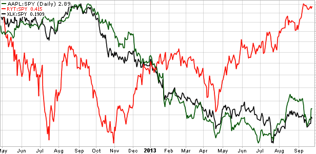
The chart below makes evident Apple's undue influence, showing the relative performance of RYT (red line), XLK (black line) and AAPL (green line).
 |
| Source: Stockcharts.com |
Pretty plain to see. When AAPL has outperformed, so too has XLK, and vice versa. It's as if RYT is nearly a completely different animal. Given this tight AAPL & XLK relationship, the ETF overly represents a single company at the expense of fully reflecting the entire sector.
Bottom line: while AAPL and XLK's relative returns have suffered until more recently, a majority of tech stocks have been doing very well in that time.
psn code generator free
ReplyDeletepsn free
psn card codes free
free playstation plus code
playstation plus redeem codes
playstation plus code generator
free playstation codes