Tuesday, June 11, 2013

A chart that keeps me up at night

Loyal readers of this blog know that I'm an avid follower of divergences. I realize there is a lag problem as they can develop over many weeks and months, making for a less-than-precise timing tool. One has to use other indicators to help nail down timing calls. Nonetheless, it's been my experience that divergences can often give ample warning for turning points and more often than not ignoring their potential implications is regretful.

The chart below shows the relative performance of the Morgan Stanley Cyclical Index versus Consumer Staples SPDR (XLP), and the S&P 500 (red line), going all the way back to 1999:

Source: Bloomberg

The relative return of cyclicals versus staples typically serves as a good surrogate for risk-on/risk-off, i.e. the risk appetite of investors. When the relative return line is rising, investors are more risk-seeking and it's bullish for the market; when the relative return line is declining, investors are increasingly risk averse and it's bearish for the market. 

As you can see in the chart, over time the relative return of cyclicals versus staples tends to track the S&P 500. Higher highs in the market (S&P 500) are usually met with higher highs in the cyclicals/staples relative return line, and vice verse regarding lows. In other words, confirmation is the norm.

However, there are times when the two diverge. I identify in the chart a few such occasions with orange lines. In 2000, the relative return line made lower highs as the S&P 500 climbed higher. In 2002-2003, the relative return line made higher lows as the S&P 500 made a lower low. In 2007, the relative return line made a lower high as the S&P 500 made a higher high. These divergences occurred around key market turning points.

Fast forward to our current situation. The S&P 500 is at news highs and yet the relative return line remains within a 2-year downtrend -- not good. 

Again, I fully appreciate that divergences can lag, but the longer they remain in place the more powerful the eventual outcome. Divergences can disappear with the gap gradually closing, thus negating its implication. But the longer the divergence remains in place, the more difficult to erase as there is too much ground to make up. 

To eliminate the divergence in this case, cyclicals have a long way to go by way of outperforming staples. A long way.

Friday, June 7, 2013

Crude oil developing massive triangle formation

Crude oil's weekly chart shows a fairly well-defined, colossal triangle formation:


Source: Finviz.com

What's interesting is after about five years in the making, the formation of the triangle's apex is near complete, meaning we will soon observe a breakout. As I've written recently, my expectation has been for crude oil to break higher from here given that energy equities have been performing well and in my experience equities tend to lead their associated commodity. 

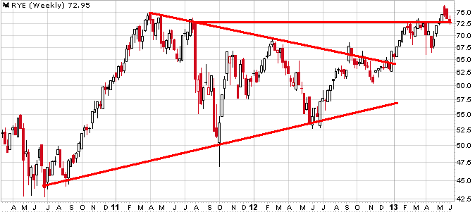
The weekly chart of the Guggenheim S&P 500 Equal-Weight Energy ETF looks bullish to me:

Source: Stockcharts.com

The ETF successfully broke out of a developing triangle earlier this year, and more recently has broken out again. Price has since retreated to the breakout level -- a fairly common and often healthy occurrence -- with $72 serving as support.

The above is an absolute price chart. How does RYE look relative to the market?

 Source: Stockcharts.com

The chart above is RYE vs. the equal-weight S&P 500 ETF (RSP) and as with the absolute chart, it appears bullish to me. Relative performance recently broke out of a triangle and ever since has been trending higher.

All in all, a bullish outlook for energy equities tends to be bullish for crude oil. Stay tuned.

Thursday, June 6, 2013

Update on Eurozone: Equities versus Economy

It's been awhile since I first commented on the divergence between equities and economic conditions in the Eurozone. To be exact, it was March 25th, but I offered follow-up commentary on April 2nd and April 26th. I figured it was time to do another update.

Since March 25th, the Citigroup Economic Surprise Index (CESI) for Eurozone has declined from 10.9 to its current value of -53.2, or a sizable -64.1 point drop in that time. Meanwhile, equities as represented by the Euro STOXX 50 Index have appreciated by 4.6% in that period. In other words, the divergence has expanded since I first wrote about it.

The chart below helps to make it quite clear.

Source: Bloomberg

Just weeks ago, the CESI hit a low and yet around that same time the Euro STOXX 50 was making a new 52-week high. I would definitely call that a divergence (!). Granted, more recently the CESI has been trending up, but it has a ways to go to establish a meaningful uptrend and until then this move is too brief to conclude anything for certain. A similar divergence developed in early 2011 and it did not turn out well for equities -- we'll see what happens this time around.

I would add that a similar divergence has emerged for the U.S., with the S&P 500 reaching new highs as the CESI has been in a protracted downtrend:

 Source: Bloomberg

The chart above shows divergences occurring in 2011 and in early 2012 and in both cases equities eventually gave way. As with the Eurozone, we'll see if the same happens this time around....

Market Update: S&P 500 breaks to next level of support

A quick update to yesterday's comments. Then I wrote that 1620 was near-term support followed by 1600, and I expected this correction to hold within that 1600-1620 range. Viewing the hourly chart, it didn't take long for 1620 to get breached and the index is currently hovering between 1600-1620 at 1608.

Source: Finviz.com

Note the extended downward trend line (red) from the preexisting triangle formation now indicates upper resistance at 1630, no longer 1640. And there are now enough price points to draw a lower-boundary declining trend line (blue) which indicates 1600 as support -- further confirming that round number that was arrived at due to 1) April's prior highs, and 2) the 50-day MA is approximately at 1600.

As I wrote yesterday, "for now, this market correction remains a healthy one," however 1600 needs to hold in a meaningful way (meaning dips to 1598 or even 1595 are OK, often just shake-out moves). If 1600 is broken beyond just a minor, brief dip, my tune will almost certainly change.

Wednesday, June 5, 2013

Market Update: Near-term correction continues....

Over the last few weeks, I've been writing about an expected correction in the market. I would say at this point it would appear that equities are clearly in corrective mode. 

On Monday, when I last commented on the hourly S&P 500 chart, the index had broken down through the triangle formation and was attempting an anemic, reflex-rally back to new resistance at the 1640-1645 level. As you can see in the updated chart below, the S&P 500 was able to climb back almost exactly to that level, which coincides with the triangle's downward trend line. 

Source: Finviz.com

The index then immediately rolled over once hitting the trend line and now resides at 1624. Since the peak on May 22nd, the S&P 500 has made lower highs four times by my count, not something one would consider bullish. Near-term support looks to be 1620.

Viewing the daily chart below, you can see that approaching 1680 the S&P 500 was quite extended from its 50-day moving average. It has since closed at least half of that gap.

Source: Stockcharts.com

After support at 1620, in the chart above it's much easier to see next support at 1600, which is the approximate level of prior highs in April and also the approximate value of the 50-day MA. 

Overall, the S&P 500's daily chart continues to look bullish. The stochastic is now oversold and I would expect any further weakness to be contained in the 1600-1620 range.

With regards to the stochastic, note that prior to its recent decline it enjoyed several consecutive days traversing at an extreme overbought level (see red rectangle). When this happens, the stochastic remaining at an extreme overbought level for many consecutive days, it's a very bullish occurrence. For lack of a better term, I call this "good overbought" (bullish overbought?). More often than not when the stochastic oscillator hits overbought levels, it indicates the move is extended and likely running out of steam, i.e. bearish. But when it remains elevated consistently for days, the stochastic is indicating impressive momentum has occurred and built up, meaning there is thrust that tends to have carry-through, enabling price to have forward trajectory even beyond an initial correction. Note that "good overbought" occurred for most of January. And I would add that all of this tends to hold true on the flip side, i.e. there is "bad oversold" (extreme oversold momentum + duration).

It's for this reason ("good overbought") coupled with the overall bullish daily chart that I expect this recent correction to be short-lived, with the market most likely regrouping at the 1600-1620 level before making another run at prior highs. In short: for now, this market correction remains a healthy one.

Monday, June 3, 2013

UPDATE: Energy Stocks vs. Commodity

Regarding Friday's blog entry where I discussed energy equities versus the respective commodity, I used WTI to represent crude oil. I did receive more than a few emails advising that I should instead use Brent, in so doing the chart could look different. Agreed and I went ahead and updated the chart swapping out WTI for Brent.

Source: Stockcharts.com

Looks very similar to my WTI vs. RYE chart. My prior comments stand.

Market Update: S&P 500 breaks down through triangle

I've been writing almost daily about the developing triangle formation in the hourly S&P 500 chart. On Friday I wrote, "we are definitely at a key inflection point with the eventual breakout from the triangle formation likely dictating the market's future direction." Well, it appears as if the eventual breakout was down.

Source: Finviz.com

The hourly futures chart above shows the S&P 500 plunging down through the lower boundary of the triangle formation, with a recovery rally occurring in the last several hours.

As per the technical truism "what was support becomes resistance," the 1640-1645 level has become new resistance for the index. Again, as I've repeated more than once in recent past postings, given we're using hourly charts the focus is short-term. Longer-term repercussions could eventually stem from these shorter-term observations, but the point being I do not wish to overstate what we're discussing here in the short-term. Let's not get ahead of ourselves. 

But as I wrote on Friday, clearly this breakdown in the triangle formation has implications for S&P 500 direction over the next several days or even weeks, i.e. it does not bode well for the market near-term.